We use cookies to make your experience better. To comply with the new e-Privacy directive, we need to ask for your consent to set the cookies. Learn more.
Relaxing Bedroom Colour Scheme Ideas
- July 09, 2025

When you head to your bed at the end of the evening, you want your bedroom to encourage you to relax, and to drift gently off to sleep. That is much, much easier when your bedroom has been decorated in colours that you love, that your furniture works well for you and you have ample storage solutions that help you ensure your space is kept neat and tidy. We’ve recently written a post about loft bedrooms that has some great ideas for decorating your space, so if you’re looking for inspiration, then you might want to put that on your reading list.
Relaxing Monochrome Bedrooms
With all of the colours of the rainbow to work with, there are plenty of ideas that can work wonderfully in bedrooms – we’ve even seen black used effectively to create a stylish and relaxing bedroom, although we know that it isn’t to everyone’s taste. In this section, we’ve pulled together some of the prettiest, stylish, and relaxing colours to inspire you as you take on your bedroom redecoration. These ideas are ones that work well as single colours – we’ll get to colour combinations that work wonderfully together shortly. Remember though, there isn’t a single perfect way to approach a monochrome bedroom, and so if you have an idea that you absolutely love, go with it!
Fresh White
Some might argue that it looks stark or clinical, but done well, an all-white bedroom can be incredibly relaxing. The key to keeping it from feeling too much like a hospital (an argument we’ve often heard) is to use textures carefully to create visual interest. Blankets and throws on the bed are a given, and you can bring in textures for items like curtains, storage boxes and baskets.
White furniture has been trending for quite a while now, and depending on your budget, there are several options that you might use:
- Buy solid wood furniture that has been painted white and finished when it is delivered
- Using affordable flatpack bedroom furniture made from materials like MDF that have a white veneer
- Upcycle wooden furniture that you already own, have inherited, or have found in a thrift store, refinishing it using whitewash or paint
There’s just one thing to remember about all-white bedrooms – they are pretty unforgiving when it comes to mess! A great laundry basket is essential, and if you’re prone to dropping items on the side, then you may want to have a solution available as a catch-all to throw clutter into when you’re emptying your pockets at the end of the day.
Dreamy Lilac
Lilac, lavender, wisteria, and buddleia – there are so many plants in dreamy shades of purple that work perfectly in the garden, there is little wonder that designers have been inspired by these hues, and they have made it into our homes. Considering the scent of lavender is well known to help aid restful sleep, it isn’t too much of a hop to introduce the relaxing shade of light purple to the bedroom. Indeed, colour psychology suggests that purples are perfect for bedrooms, since they are thought to have a soothing effect on the body, and since purple is made up of red and blue, both known for their sensual and passionate properties – well, you can join the dots.
Sky Blue
Summer days spent at the beach means that we see an array of different shades of blue, from the sky to the azure ocean – and when you think about how relaxed you feel when you’ve been on the beach all day, it makes sense to recreate that feeling in your bedroom.
When it comes to sky blue, there are plenty of shades to make the most of. You might be consider using the lightest off-white with a hint of icy blue, through to a lightly greyish blue, or you might go for a deeper shade that is almost a royal blue – and they all count as sky blue!
Blues are also known to help increase feelings of loyalty and trust, making it a perfect choice for bedrooms that are shared by a couple.
Dusky Rose
A few years ago, we saw all that ‘Millennial Pink’ that was absolutely everywhere – you could barely see any other colours if you searched for bedroom posts on Instagram! While Millennial Pink is slowly being phased out, shades of rose quartz, and dusky rose are still popular.
Rather than being trendy, dusky rose feels much more timeless, although still feels modern when accessories in rose gold are brought in. Don’t forget, when you’re decorating a bedroom, it isn’t always about the colour of the walls and the bedding. If you’ve got a bigger bedroom, you can create a seating area that means you can have morning coffee (or perhaps a nightcap) just a step away from your pillow, or maybe a desk space – all of which provides you with even more opportunities to bring colour in.
Straw-Toned Yellow
Yellows can be overwhelming in a bedroom – the bright zesty tones being too invigorating for a room that is meant for sleep. But if yellow is your favourite, then more muted shades of straw can be the answer, with natural accents such as wicker and wood, or pick a neutral wallpaper with pops of golden yellow, and then use pops of yellow throughout the room.
We’ve also seen designers using incredible (but definitely love it, or hate it) yellow paint on ceilings, using artwork and painting shiplap and wooden furniture to create the yellow hues of your dreams without it becoming too much. A word of warning, however, for expectant parents. Research has shown that babies cry for longer when they’re in a yellow room, and that is definitely something you’re likely to want to avoid, so when you’re choosing the colour for your nursery, skip over yellow!
Sandy Beige
Thinking back to our days on the beach, shades of sand, beige and light tan are a great neutral to work with in a bedroom. The neutrality of the tones means that they’re often used in guest bedrooms, where they are suited to anyone – and since they’re soothing, your guests are much more likely to get a great night’s sleep, even though they’re away from home.
Sandy beige is a warm neutral with yellow and brown tones (and of course, brown has red tones too), and so can work in rooms where grey simply feels too cold – although if you’re painting with a sandy shade, be careful when you’re choosing the colour. A shade that has too much yellow undertone is likely to present as the ubiquitous (and often ridiculed) magnolia – and although magnolia is fine if you’re intentionally choosing it, if you’re looking for a more golden colour, you don’t want to be disappointed.
Soothing Sage
Just as in nature, shades of green are recognised for having a rejuvenating effect on the body, even when the colour is being provided by our interior décor. However, considering that that is the primary goal of sleep – to rejuvenate – using green in your bedroom décor is a great way to boost the benefits of your time resting in your bedroom.
When it comes to your furniture in a sage bedroom, we think there is a lot to be said for keeping it natural. Wood, rattan, jute – they’re all found in nature together with sage colours – which means that they work fantastically alongside sage décor.
Don’t just rely on bedding and soft furnishings to bring in shades of green either, especially if you’ve got natural furniture. House plants are great for helping to cleanse the air, meaning that as you sleep, they take in your carbon dioxide and give you back fresh oxygen – win-win, we’d say.
Peachy Orange
Bright orange in a bedroom is likely to be a no-no for most of us, but there are some wonderfully restful, yet invigorating shades. Peaches, apricots, and corals can be beautifully warming in bedrooms, with the benefit of having revitalising effects on the body – making it far easier to wake up in the mornings.
However, there are a lot of people who are intimidated by orange décor, and we understand why. You can step in gently by using a watered down shade of peach on walls, which in many cases acts more like a neutral, and then bring in deeper shades of orange – those peaches, apricots, and corals we mentioned before – using accessories.
Lighter shades of orange are great for children’s bedrooms too, since the warm tones are both comforting and uplifting.
Hushed grey
When pure white décor is just too plain, then quiet grey tones are ideal, particularly in minimalist bedrooms. Lighter greys are known to be soothing and calming, opposed to the solemnity of darker, charcoal shades of grey. Grey bedrooms have been trending for a while now, which means that there is an abundance of items that can coordinate perfectly – since they don’t have to be exactly the same hue to work well – and to provide visual interest with texture.
If all-grey walls sounds a little dull, look for marbled wallpaper, or a mural-effect that brings in different hues to increase visual interest.
Terracotta red
If you’re decorating a particularly cool room, then you can certainly help the space feel warmer by reaching for warm, earthy shades of terracotta. Because it is a natural shade, it is a more gentle way to introduce colour, making terracotta ideal in bedrooms – and can work well alongside darker furniture, and decorative accessories, which is how so many homes and hotels use it in hotter countries along the North African Mediterranean coast. You might play up the African feel by adding netting over the bed, and by using natural and handmade accessories, such as bedside lamps with mirrors on the base.
Tranquil taupe
If you’re looking for a neutral with a bit more interest, consider taupe. A mid-shade somewhere between grey and brown, taupe is a great shade for wall décor in bedrooms, since it works well with so many other neutral shades, making it easy to put accessories together. With taupe walls, furniture can be grey, have any shade of a wooden finish, and it works well with many brighter colours.
As with white bedrooms, you’ll need to bring visual interest in using textures – the padded velvet headboard in this example looks really luxurious, and with a fleecy blanket, this bed looks super cosy for curling up in.
Seafoam Turquoise
Deep shades of sea-green, seafoam and turquoise all work well in bedrooms, and they are incredibly on trend at the moment. We’ve seen examples where designers have evoked the feeling of being underwater simply by painting the ceiling the same shade of turquoise as the walls, or paired turquoise ceilings with cream walls and accessories like an ottoman and a headboard in the same hue.
If you’ve got a fashion-conscious individual in your household, then you might use the turquoise blue shade of the Tiffany and Co box with the white ribbon as your inspiration for their bedroom décor – just add lush white, and pops of silver to complete the look.
Deep Blue
Whether you reach for the jewel-toned shades of sapphire, or you consider a more industrial blue with hints of grey, deep blues make for a wonderfully restful bedroom. If you’re decorating a masculine bedroom, deep blues may be a satisfying compromise if the intended wants all-black everything when it comes to furniture and bedding.
Amethyst
As we’ve already mentioned, shades of purple work wonderfully in the bedroom, and as a jewel tone, amethyst is a great option to create a rich and sumptuous look. The use of purple in décor is pretty controversial though, and many people have strong opinions about it – usually either love or hate.
An ideal way to make use of amethyst tones in a bedroom is to use sleek, contemporary furniture, and to keep clutter to a minimum – even if you’re not aiming for a minimalist bedroom. This keeps the colour as the star of the show, and doesn’t make the room seem overwhelming.
Crimson
In bedroom décor, many of us steer clear of reds, for fear of it being overwhelming. But it is traditionally considered lucky, so get the right shade, and you might be onto a winner! As with other bright colours like yellow, a great way to bring red into the bedroom is to use wallpaper where it is the primary shade – meaning you’re getting the effect, without painting the walls completely red.
There are relatively few all-red bedrooms, since the colour is pretty overwhelming. Most bedrooms that feature red are likely to use black – such as on the furniture – in order to increase the drama, or they use make use of white bedding and flooring to balance and cool the shade. A word of caution, however – when you’re buying items for a red bedroom, be sure to choose paint, bedding and so on carefully, since some shades of red are associated with tacky Valentine’s Day gifts – which is unlikely to be the effect you want to achieve.
Emerald
Perhaps one of the less expected colours for the bedroom, emerald can look great – and depending on the styling, can look incredibly modern, or really classic. The image we’ve chosen below has a lovely emerald headboard, but the walls and even the ceiling could easily have featured a deep shade of green too, since there are plenty of designers using this as a feature.
Just as with sage, green is incredibly good for us, and since emeralds are naturally occurring, the shade works well with almost any other natural shade. However, if you’re considering using red alongside emerald, be careful with the tone that you choose, since the pairing might be a little more ‘Christmas’ than you’d like.
Black
Trust us, we hear you – why would you want to paint your bedroom black? But if you have a bright bedroom, and you’re already considering how thick your curtains are going to need to be to block the streetlight out, then black décor could be your next idea. The key to using black in your bedroom? Plenty of daylight, and just as with white bedroom décor, you’re going to need plenty of textures.
The thing is, with black décor – especially if you bring in black bedding and furniture to really absorb the light – you’re going to need to light the room differently, because of the darkness. This is easily done though, and there are some great ideas here – from LED strips to using dark woods, bringing in house plants, and using art work to cast some light and to break up the darkness.
Relaxing Bedroom Colour Pairings
Monochrome isn’t the only way to create a wonderfully relaxing bedroom, and while these aren’t the only colour pairings that can work together, these are some of the most popular colour combinations that designers are using at present.
Preppy Red And Blue
Having two primary colours together is a pretty bold combination for a bedroom, but red and blue is a classic nautically inspired combination that is unlikely to ever go out of style. If you love this look, you might go all the way, adding a round mirror to evoke the feeling of a porthole, gold coastal lights and bring in nautical motifs like anchors and oars.
The combo works well in children’s bedrooms, and is balanced with pops of white – and of course, for patriotic types – perhaps those currently living away from their home country – it works well with the Union Flag, and the Stars and Stripes of the United States. With that in mind, check out both Tommy Hilfiger, and Ralph Lauren homewares – they’re both favoured for the preppy look, and they both have lots of blue and red bedding options to inspire your bedroom styling.
Chocolate And Blue
It isn’t necessarily a classic pairing, but brown and blue work well together. This combination works whether we’re talking about this deep blue, or shades of turquoise blue – and that’s because pretty much all shades of brown and blue are both earthy in nature. Lighter shades of tan and teal are great options together too, so whether your furniture is light or dark wood, you can make this classic combination work for you.
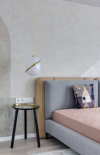
Grey And Rose Pink
Grey and pink together can make for a lovely bedroom combination – and depending on how much of each shade you use, can be suited to any member of the family, from children through to adults. If you’ve currently got a Barbie pink obsessed child who you suspect will tip into adolescence and reject that strong pink pretty soon, then grey and pink together might be the compromise that you can both live with. Remember, if you keep pink to the accessories and they change their mind, the grey is a great neutral that will pair well with other shades.
While the example below clearly doesn’t have the bed made up ready to sleep, you can see how the shades complement each other nicely. If you’re looking to employ the 60-30-10 rule that we talk about below, in this image we’d consider the gold on the light fitting and the table as being the accent colour.
Black And White
The crisp contrast of black and white might seem illogical for a relaxing bedroom, but as you can see from the example below, the key to getting it right is to ensure plenty of pattern and texture play. The zig-zag stripes on the cushions against the horizontal stripes on the pillow behind coordinate with the heaviness of the mirror, while the tiled effect on the walls ensures that the white isn’t too stark. Tiles are a risky choice in a bedroom, but the use of the black accessories means that it feels less like a bathroom than it might if the accessories were blue.
You’re not short on the number of options when it comes to black and white patterns either, and it isn’t just stripes! Zebra stripes have never really gone away, nor have white tigers stripes, and cow skin rugs (faux, of course), banana leaf and palm prints – and that is before we get to man-made patterns! Black and white chevrons were everywhere for a while, boxy ‘window frame’ style patterns are still going strong – and of course, plenty of other combinations.
Chocolate And Cream
Classic and indulgent, chocolate, and cream pair together perfectly in bedrooms to create a warm and relaxing bedroom, and just as there is plenty of choice to be found in chocolate boxes to inspire your décor, so there are endless combinations that work perfectly. If you’re not keen on the idea of chocolate walls, consider cream and golden caramel shades for wall décor, and keep the chocolate shades for furniture and floor coverings.
This look is a great way to use older, and more classic styles of furniture in darker wood finishes since they are already perfectly suited to the colour scheme, and by bringing in luxurious metallic golds for a truly chocolate box inspired bedroom interior.
Pink And Navy
Dark blue walls are having a moment at the moment, and they can be a little intimidating – especially when you consider that darker walls can make a space feel smaller, and for most of us, that isn’t a good thing in our homes. However, if you love the look, the key is to use lighter, brighter shades alongside them. We’d consider pairing navy or indigo walls with plenty of white and pops of either a rosy, pastel pink, or deep fuchsia pink in order to stop the darker walls from feeling oppressive.
Yellow And Grey
Pantone chose Ultimate Gray (17-5104) and Illuminating (13-0647), a bright sunshine yellow for the joint colours of the year for 2021, and we can certainly see why. While bright yellow walls in the bedroom are likely to feel a little bit too intense for most of us, the combination is striking. Used carefully, with grey as the primary colour in the palette, and yellow as the accent colour on throws, pillows, and curtains, yellow and grey can be an uplifting and relaxing colour combination.
The great thing about working with combinations like this, especially where the primary colour is relatively neutral, is that you can easily switch out the accessories and get a completely different look. You might opt for pops of deep red throughout the cooler months to increase the cosy factor, and keep the sunny yellow hues for the summer months.
Pastel Shades
This bedroom colour scheme is somewhat of a classic when it comes to children’s bedrooms – and when you think how much kids tend to love ice-cream, it is easy to see why! We expect this will remain a staple colour palette for children’s bedrooms everywhere, we can see exactly how these shades – and those shades of pale blue, baby pink, minty green, and sherbet orange – could easily work in an adult bedroom too.
The key to stopping the pastel bedroom from feeling too babyish is to use no more than two pastel hues together at once, and to balance them with white. So, you might use a pastel blue, and a mint green together, but if you add a light lilac shade, you’re going to start looking too childish.
Some designers say that pastel shades make small spaces look bigger, and so there are many ways that we can see a pastel palette working:
- Baby blues with bright whites and darker accents
- Using pastels for the accent colours
- Alongside white furniture
- Bring in artwork that features pastel shades
- Paint a pastel shade on the bedroom ceiling to contrast with white walls
- Use pastel shades as part of a wider palette
- Tone down pastels with grey
- Bring in an array of pastel colours on wallpaper
White, Navy, And Teal
The space in the image below clearly belongs to a lucky child, but we absolutely love the combination of the colours, and can see them translating to a minimalist bedroom with plenty of crisp, clean white like this one – with the navy contrasting beautifully.
Reminiscent of Mediterranean seaside villages and sailboats on the water, navy blues, shades of turquoise or teal, and white together creates a calming pairing that makes us long for sunny days on holiday. Adding silver accessories to a room decorated this way – such as adding silver lamps to a bedside table, a mirror and maybe a clock – would lift the space further, without detracting from the subtly nautical effect.
Your Choice Of Colour And White
While we’ve recommended some combinations that include white here, the reality is that if there’s a colour that you love and you want to make it work as part of the décor in your home, you can almost always make that happen by pairing it with white. It is perhaps the ultimate neutral – many decorators recommend painting a home white, until you decide what speaks to you about the colour scheme you’d prefer.
Accent Colours
Just one or two colours might not be enough for some of us to completely express our personalities. With that in mind, if you’re considering using more than two shades in your bedroom, then these are some of the ways that designers create a design that features more than one or two colours.
60-30-10 Rule
When you’re combining more than two colours in your bedroom, it can be tricky to know how much of each colour to bring in – and if you’re not careful, it is possible to end up with a complete imbalance that just doesn’t look right. Luckily, there is a rule that designers use to ensure that the colours they choose balance with each other – the 60-30-10 rule.
The idea is pretty simple – that each of the three colours in your palette are used in just the right amount, with the main colour taking up 60% of the room, the secondary colour is used for half of the main colour, and 10% making up your accent colour.
- To put that in an example, using the chocolate and cream bedroom idea:
- The main colour in this bedroom is either chocolate or cream, and we’re choosing chocolate in this case. So, chocolate needs to be 60% of the décor – so the walls, maybe a rug, or an item of furniture.
- The secondary colour is cream, so you’ll use cream accessories like curtains, bed linen, or an accent wall.
- For the third colour, we’re suggesting antique gold makes up the final 10% – so, a gold mirror, wardrobe door handles, artwork that features gold, maybe lamps, candles, or photo frames. You don’t need to go overboard here, otherwise you’re at risk of the look becoming overly matchy-matchy.
Of course, you don’t have to use the 60-30-10 rule – some designers suggest using two accent colours, and of course, if you’re going monochrome then you’ll be looking for everything in the same colour anyway. In addition to that, there isn’t really any reason to stick with rules if you don’t want to – it is your bedroom, and your home, so break all the rules if that is what looks and feels great to you!
Pops Of Colour
If you don’t like the idea of fixing your colour scheme to one single colour, or you like to be able to change the look and feel of your home regularly, then opt for a neutral décor, and add pops of colour using accessories. This means that simply by switching out cushions, bedding sets, throws, and even flowers, there is the potential to freshen up your home from season to season, or whenever the feeling takes you.
Metallics
Many items of furniture have metallic accents such as shiny chrome handles, and so when you’re choosing your furniture, think about how else you can pick up those tones, whether they’re silver or gold. You could add in a vintage mirror with a gilded frame, choose bedside lamps in similar hues, and even go as far as swapping the light switch fittings for ones that match with the colour of the metallics in your bedroom, for a much more elevated look.
I’m Still Not Sure!
That’s OK – many of us agonise over the decision when choosing new décor for our homes, and it is pretty normal to take a while to decide. If you’ve got an idea in your head that simply won’t go away, simply search online for the combination that you’re considering – we haven’t found a décor idea that hasn’t been done in one iteration or another, and been photographed for posterity. When you find images you like, be sure to save them – Pinterest is great for this purpose, but you’ll need to be careful, since you can easily end up searching Pinterest for hours!
Our Final Thoughts
Ultimately, the colours you choose for your bedroom should be ones that you absolutely love – especially when you think about the amount of time that you spend in there. While you might consider the colours that are trending at the moment and your choice might be influenced by them, we think that it is far more important that your home is a space you enjoy spending time in – and most that your bedroom is a relaxing place that you enjoy drifting off to sleep in.

Share on Facebook

Share on X

Share on Pinterest
0 Comment(s)
Recent Posts