We use cookies to make your experience better. To comply with the new e-Privacy directive, we need to ask for your consent to set the cookies. Learn more.
2021 Colour trends for every room in the home
Posted:
July 21, 2021
Categories:
Home
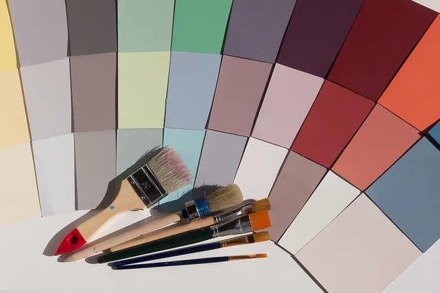
Spending so much time working from home recently has got many of us thinking that it is time to freshen up our homes, but it can be hard to be inspired if your home hasn’t been different colours before, or if it is the first time you’ve been let loose with a paintbrush. If following trends is important to you, and you want your home to reflect that aspect of your personality, then you’ll be here to find out the exact shades that are trending in the home.
In this post, we’ll be looking at colour giant Pantone, paint brands Dulux and Benjamin Moore, and stock photography behemoth Shutterstock’s selections for colours of the year, considering colour psychology and why it is important for the home, how to add colour temporarily and in bathrooms, and whether using more than one trend at a time is a good idea, before looking at homeware trends that are big in 2021.
Colour trends of the year
When you’re starting your search for colours to use in the home, looking to the trends can be important – particularly if you don’t want your home to look dated quickly. If that is the case, you might opt to use watered down, gentler versions of the shades, or use a neutral tone for wall décor and add colour using soft furnishings that can be switched out at will, with much less effort and at much lower cost than completely redecorating.
To find the colours that are trending in home décor in 2021, we’ve looked to major brands that we know influence the colours of the year. These trending colours get everywhere, from clothing and apparel, right through to homewares and interior design.
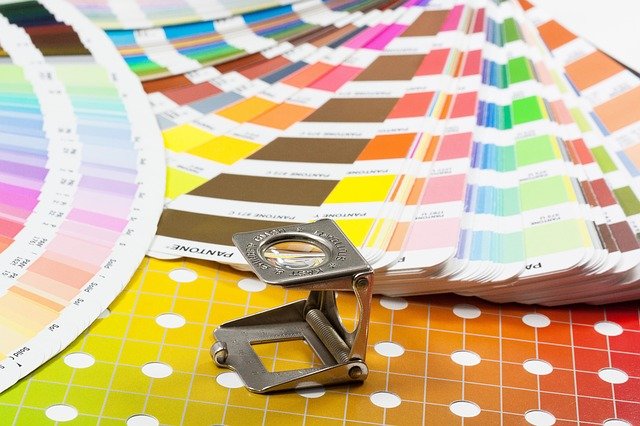
Pantone
Pantone is well known worldwide for standardising colours and creating a universal language of colour for interior, and fashion designers to work with and refer to. For the past twenty years, they have chosen a colour of the year, to represent the collective consciousness and to inspire and encourage us in the year ahead. Whichever colour they choose is quickly adopted by creative types throughout the world – do you remember all that ‘millennial pink’ that happened around 2016? That’s not only due to Instagram, but it is also partly because Rose Quartz (13-1520) was chosen as one of the colours for the year, alongside Serenity (15-3919), a shade of deep pastel blue. Although Serenity was much less reported on, many of us still remember the pale pink of Rose Quartz, simply because it was everywhere!
This year, for only the second time in the history of their choosing, Pantone chose two complementary shades to represent 2021. They opted for Pantone Ultimate Gray (17-5104), a resilient shade of deep stone grey, and Pantone Illuminating (13-0647), a bright, vibrant yellow. When they’re paired together, the hues remind us of the sun emerging from behind rain clouds – a wonderful reminder that as the rain passes, the sun will shine again – which, considering the storm of emotions that 2020 and turmoil that the pandemic brought us, seems like a fitting metaphor for this year.
Ultimate Gray
Grey colour palettes have long been trending in interior design for use throughout the home because of the calm, restful feel that they evoke. Shades of grey are neutral, and work well with palettes of pastels, or can act as an anchor for brighter shades like Illuminating.
How to use Ultimate Gray in the home:
- Alongside whites to allow the white to pop
- With beiges and browns for a minimalist, stony palette reminiscent of pebbles on the beach
- With navy blue and hunter green for a masculine effect
- With electric blue and white
- Use a statement colour alongside it (like Illuminating!)
- With shades of green and lime
- With warmer shades of orange or peach, or blush pink
- As a backdrop for pops of raspberry, or cherry red
Whether you choose to use Ultimate Gray as the primary colour in the room, or simply as a backdrop to other brighter shades, you’ll find that it looks both on trend and classic, meaning that it is a great choice for your home – particularly if you’re planning to sell in the near future.
Illuminating
Illuminating was chosen for its aspirational qualities, and to give us the hope that as the year progresses, things will get brighter. While it can feel like an intimidating shade to work with, bright yellow can be used in different ways – either as a highlighting colour, or paired with darker hues for contrast.
How to use Illuminating in the home:
- As an accent colour and to provide pops of colour
- Use against purple – shades of deep plum and aubergine contrast beautifully with yellow
- Look to the sky for inspiration – yellow looks wonderful with shades of blue and white
- Try graphic black and white patterns for a bold, energising effect
- Pair with shades that occur together naturally – greens, pinks and oranges can look gorgeous with yellow
While using the yellow of Illuminating in the home might feel simply too bright, you don’t have to go all out – and you can also reach for pastel versions of the colour, such as lemon and mustard. Since the shade of Fortuna Gold is also trending, you can mix and match what feels right for your space, and still look right on trend.
Dulux Brave Ground
Leading UK paint manufacturers Dulux opted for Brave Ground, a warm earthy taupe that works well throughout the home as a neutral shade. They chose it as a shade that can provide a feeling of stability, growth and potential – which feels like a great way to help us to move on from 2020.
How to use Brave Ground in the home:
- As a balance for bolder shades of pinks and reds
- Alongside blues, greens and other naturally occurring earthy tones
- With other soft, natural shades such as lavender and stone
- Pair with the trending shades of Set Sail Champagne and Fortuna Gold (we’ll talk about those in a moment!)
If you’re planning to sell, or rent your home in the future, and you’re looking for a neutral shade that isn’t boring and is an alternative to grey, Brave Ground is a lovely place to start.
Benjamin Moore Aegean Teal
It seems that US paint specialists Benjamin Moore were inspired by the travel lack of travel through 2020 when they were choosing their colour of the year for 2021. With few of us being allowed to (or felt safe and confident to) travel, it makes sense that we’re aiming to bring a little bit of vacation to our homes, particularly through the warmer summer months.
Aegean Teal (2136-40) is a gorgeous sun baked blue-green that brings us directly to the sleepy Greek and Turkish villages. It is a relaxing shade, and we can see it looking fabulous in bedrooms paired with crisp white linens and pops of gold.
How to use Aegean Teal in the home:
- Alongside crisp whites, and off-whites
- With shades of champagne, gold and light yellows
- Paired with darker earthy tones, and shades of rock and clay
- With rosy peaches to provide contrast and pops of warmth
As quite a strong shade, you’ll want to use this colour in rooms with plenty of light. If you’re working with a room that doesn’t get a lot of sunlight, rather than putting the colour on the walls, choose a light, neutral shade for paint or wallpaper, and add the colour with soft furnishings.
The Shutterstock Colour Trends Report
While Pantone and the paint manufacturers highlight what the designers think is on trend, to know what colours are trending from the general public, we look to stock photography giant Shutterstock. Each year, they compile a colour trends report that shows us which colours are being searched for in image downloads, which tells us what type of colours are likely to dominate the year ahead. They’re the colours that reflect the collective consciousness, and that tell a story about what society is craving as a whole. In the Shutterstock 2021 Colour Trends report, there are three shades that emerged as trending: Set Sail Champagne, Fortuna Gold, and Tidewater Green.
Set Sail Champagne
Considering the lockdowns that we endured through 2020, as we noted when we discussed Aegean Teal, there is little surprise that there is demand for shades that transport us to foreign shores with gradually fading sunsets. Set Sail Champagne (#FAEBD7) is a perfectly pale, a neutral shade that feels gently warm owing to the slightest hint of pastel orange.
How to use Set Sail Champagne in the home:
- As a grounding shade against almost any other colour
- As a complement for earthy browns, beiges and taupes
- Alongside greens and blues, including Tidewater Green
- For a feminine look alongside pink or lavender
- With black to evoke the colours of Art Deco (though it is wise to use black sparingly)
If you’re looking for a beautiful neutral that is an alternative to magnolia, we highly recommend Set Sail Champagne for dining rooms and kitchens. The hint of orange appeals to the desire to eat, without the brightness of a true shade of orange.
Fortuna Gold
Many of us are seeking a bit of luck after what was quite a difficult year last year, and Fortuna is famously the Roman goddess of good fortune. Her colour, Fortuna Gold (#DAA520) is the deep, rich shade of yellow that is found in the sunshine during golden hour, in beautiful autumn leaves, and in the endless wheat fields under summer skies.
How to use Fortuna Gold in the home:
- With black for a rich look
- Alongside jewel shades such as amethyst, turquoise, and emerald
- With Cerulean blue, mimicking those wheat fields and summer skies
- Alongside Set Sail Champagne
- With natural shades of terracotta and ochre
Shades of gold need to be used carefully in the home – although they can look incredibly elegant, there is a risk of them starting to look quite the opposite if they are over-used, or the items chosen are too gaudy.
Tidewater Green
Going back to the desire to escape the realities of the pandemic to faraway lands, Tidewater Green (#2F4F4F) is a rich deep teal with grey, blue and yellow tones. It is not only reminiscent of the deep changing tides, but it is also evocative of the jungle canopies of the tropics. Because of the changeable nature of the shade, it can provide an intense background to other shades such as the red oranges of coral reefs, or it can be used as a base colour for brighter shades such as lavenders and sage.
How to use Tidewater Green in the home:
- Create a pretty effect with paler shades of Tidewater Green alongside soft pinks
- Create contrast with whites – think of yachts on the ocean
- With yellow (Illuminating, or Fortuna Gold) for a warmer contrast
- For a more classic look with rich shades of brown or black
- Alongside other shades of blue and green
As a deep shade, Tidewater Green could feel a little too intense for small, or darker rooms. As with Aegean Teal, there is always the option to use Tidewater Green as your accent colour, and to use different tones in the shade – it is absolutely appropriate to reach for pastel versions of teal and turquoise.
Shutterstock Global Colour Trends
The global colour trends part of the Shutterstock report makes for interesting viewing, showing the most frequently searched shades in twenty countries worldwide. If you’re looking for inspiration, this is a great place to start!
In the UK, we’ve been most frequently searching for shade #F08080 – a deep, intense shade of coral pink, while shades of purple are trending in eight countries, including the US, Canada, Australia, France and Italy. If you’re looking to create a certain vibe from a particular country, then start here when you’re planning the colour palette.
Consider colour psychology before you choose
There are reasons that some colours work well in certain areas of the home, and less so in others. The theories behind colour psychology started to emerge in the 1940s, when it was found that different colours could provoke different physiological reactions. When you’re decorating your home, you might want to ensure that you use colours to optimise your use of the rooms – you don’t want to inadvertently encourage the body to be stimulated when it is bedtime!
Reds are found to represent energy and action, boosting physical energy levels as well as prompting the release of adrenaline. Shades of red are also linked to the physical desires – both sexual, and hunger, which explains why reds are used to represent passion, and are used so extensively by restaurants and fast-food outlets. Use shades of red in the home in bedrooms, kitchens, and dining rooms to evoke those physical responses.
Oranges are found to be stimulating, and because many oranges have a lot of red tone in them, they can be used in place of reds for a softer look – particularly, for example with shades such as apricot, peach or terracotta. Orange is also linked with social communication, so use it in spaces where you want to linger chatting with guests over another drink.
Yellow is one of our colours of the year, and although it is a creative colour, activating the analytical brain to help us be more decisive, it can create anxiety, nervousness and in completely bright yellow rooms, people can become frustrated and angry quicker. Research also found that babies cry more in yellow rooms – which is well worth knowing before decorating a nursery!
Pinks, sharing red tones are also associated with romance, and are generally seen as warm and calm, but they are also associated with over-cautiousness, a lack of willpower and self-worth – so it may be best to avoid using pink for office spaces.
Greens are nurturing and rejuvenating, encourage emotional balance and calm, as well as encouraging the feeling of the need to belong – which means it can be a wonderful colour to use in mixed use, social spaces throughout the home. However, it can cause inconsideration and hypochondria, so it may be best to avoid using it in bathrooms – particularly if there is only one!
Blue is the colour of trust, honesty, loyalty and responsibility, and strong blues encourage clear thinking, while lighter blues can calm the mind, aiding concentration and communication. In homes, blue is often thought to feel cold, but pairing it with other shades mean you can reap the benefits of the shade without needing to turn the heat up!
Purples can evoke inspiration and imagination, as well as calming the body. However, in some settings it has been observed to bring out irritability, impatience, and arrogance – so use the colour carefully.
White is sometimes thought of as being too stark, sterile, or boring in the home, but where simplicity, cleanliness and neatness is required, it is a good place to start.
Black is rarely used on walls in homes – certainly in the UK anyway – due to its connection with sadness and mourning. However, when used carefully, black can offer strength and comfort, as well as formality and sophistication – so while you might not be reaching for black paint just yet, using it for soft furnishings may be an option to consider.
Greys, as we mentioned before, are often used as great neutrals. However, the effect on the body is different depending on the shade that is being used – lighter hues are found to be soothing and calming, whereas darker greys are more likely to be associated with depression, self-denial, or lack of emotion.
How to add colour temporarily
If you’re in rented accommodation, or you’re living where changing the colour of the walls simply isn’t an option, it can feel frustrating when you want to put your own stamp on the place. Magnolia might be the paint colour of choice because it is a neutral that works with almost every other colour, but it has been used in so many properties that it has become dull. However, if you’re living with magnolia for the time being, you’re in luck, because whichever colours you want to add to your space, there are ways to add them in temporarily and make your space feel more like your own.
- Choose large, colourful pieces of art, or tapestries – you don’t even need to damage walls with nails if you use Command Hooks
- Use colourful soft furnishings such as pillows, throws and curtains
- Make your furniture colour – buy sofas or chairs in your favoured shade, or find universal covers if buying new items isn’t a possibility at the moment
- Add bright rugs to cover boring beige carpets
- Paint wooden dining chairs and tables
- Add plants and trees to your indoor space – green is trending, and you’ll get the added benefit of having cleaner air too!
- Use photos that you love in inexpensive frames (or printed on canvas) to bring pops of colour in
Don’t forget, you can use just one of these ideas, a combination of them, or all of them at once – it is your home, so do what feels right for you!
Using trending colours in bathrooms
We’ve given this room a separate section, since many people tend to shy away from colours in bathrooms, sticking to white bathroom suites with silver or gold toned hardware in order to avoid the room looking dated too quickly. A classic white bathroom suite with neutral shades simply won’t ever go out of style – so investing in good quality, simple décor is a wise choice.
But that doesn’t mean you have to avoid style trends in your bathroom completely. A white bathroom can stay current of colour trends and feel updated quickly by swapping out accessories. We suggest:
- Swap out towels and bathmats for a quick refresh
- Changing shower curtains – especially if they’re past their best!
- Toothbrush holders are easy to switch out – look for glassware in the shade you’re accessorising with
- Change out accessories such as bins, loo seats and shower mat – this blue set is reminiscent of Aegean Teal!
- Add baskets in your accent colour, or shelving (painting wooden shelves works too!)
- Add a plant (orchids often thrive in bright bathrooms – just don’t leave them in direct sunlight)
- Replace your mix and match of bottles with coloured pump dispensers for shower gel, shampoo, and conditioner – just be sure to have refills ready!
- Add tiny art prints
- Choose a colourful laundry hamper
- Add decorative hooks for towels and robes – we love these bird beak hooks for a little bit of quirky colour!
If you’ve got towels that you’re discarding don’t throw them out! Your local animal rescue charity may be able to make use of them – so check with your local vet surgery, or the RSPCA.
Using more than one trending colour
If you’re feeling inspired, fantastic! Since your home reflects your personal taste and style, it’s up to you how you implement these trends. Although trying to incorporate all of these colour trends at once in one room might be a little over the top, using two, or even three of these shades in the same room can work well.
If you’re unsure about using more than two colours together, then apply the 60-30-10 rule to ensure that your space doesn’t become overwhelmed.
- Start by picking the shade that you want to use the most of – in many cases, this will be the neutral shade, so that it doesn’t feel overwhelming – and that will take up around 60% of the space, usually on the walls.
- Next, decide on your secondary colour – this is often a bit bolder – and will take up around 30% of the space in the room. In living rooms, this is likely to be your sofa, while in bedrooms, it is often on the bedding.
- Finally, decide on the accent colour. This is usually the boldest colour, and you’re likely to be using it in pops, such as on cushions, light fittings, or accessories such as candles and plant pots.
Homeware trends that are big in 2021
While we were looking at colour trends for 2021, we uncovered plenty of other homeware trends – and so we thought we’d have a look at some of the trends that you can include in your preferred colour.
Masculine Shades
Good Housekeeping first observed the trend towards much deeper, masculine shades of deep navy blues, saddle browns and hunter greens, as well as moody peacock and petrol blues, and charcoal and off-blacks last year, and the trend is going nowhere. These shades are great for making a statement, or for a classic look when used as an accent colour in a room. Despite the fact that they’re masculine, these shades don’t have to feel too ‘manly’ in a space though – you can balance out masculine shades with neutrals, jewel tones for a sumptuous, indulgent feel, or add contrast with pastel shades.
Masculine shades look fantastic in against all styles of kitchen – from industrial styling to rustic farmhouse kitchens. Search ‘masculine kitchen’ for some striking design ideas. We’ve seen minimalist designs that look great with masculine shades of navy blues, and vintage kitchen designs that are complemented by shades of saddle browns and chestnut. Contemporary kitchen designs with splashbacks tiled in Hunter Green provides gorgeous and unexpected colour.
Dining rooms look classic with dark wood tones – look for shades of walnut and oak, and pair with traditional accessories. Any dark masculine shade will complement your furniture perfectly, especially in rooms with exposed beams.
A stylish sitting room with dark and moody masculine shades on walls makes for a cosy space – simply pair with furniture like media units and shelving in darker wood finishes. If solid colour painted on all four walls feels too dark, try a wallpaper with a pattern – the deep green on this wallpaper contrasts the deep colour of the finish of the wood flawlessly.
If dark walls feel too intense, consider darker flooring to continue the masculine feel of darker wooden furniture, or pair darker furniture with paler walls – white and silver wallpaper, although lighter, can effortlessly continue the masculine theme.
Masculine shades in bedrooms can create a lovely cosy feel. It creates a classic look that is easy to update as colour trends change, and no doubt helps to create a lovely darkness in the room that can aid with dropping off to sleep. If dark walls feel too claustrophobic in smaller rooms, go for minimal furniture in dark finishes to create a masculine feel. Here our Branson slim bedside table provides just enough room for a morning coffee and your bedtime book, without taking up too much space.
The use of texture
Layering shades from the same colour palette with different texture really isn’t anything new, but it’s a trend that will continue to go strong through 2021. Many of us have been using this approach for some time in bedrooms and the living room, adding textured blankets and cushions, but you might create a different effect with plants or dried flowers, artwork, storage such as wicker baskets, and so on.
Velvet
One of our favourite fabrics for upholstering our chairs and sofas, velvet is predicted to be a trend for 2021. Velvet’s luxurious feel provides a fabulous addition to a room, and is of course wonderfully comfortable to relax on. Choose a velvet Chesterfield style sofa in an intense shade of navy or hunter green for a classic piece that will never look dated, or for a bigger statement, choose a chair in a bright orange velvet.
Chintz
We’re not entirely sure how many of us will go for this one – we honestly thought chintz was gone forever! Recently though, the ‘cottagecore’ trend has emerged, with a number of designers including chintz patterns used to great effect. If you’re unsure what chintz is, it’s simply traditional patterns on light backgrounds, with florals being a major feature. We’ll be taking baby steps with this trend, rather than immediately wallpapering our homes with chintz throughout – we’re considering tracking down chintz featuring trending shades for bedding and cushion covers, for a more modern feel.
Sustainable and responsible
Reusing and repurposing is a major trend for homes in 2021, and one we expect – and hope – will continue for years to come. Finding vintage pieces for the home can be incredibly rewarding when a guest asks you where you found a particular piece, and you can tell them that you found it for just a few pounds at a local charity shop.
Our own social spaces
There was a change in lifestyle for many of us prior to 2020, moving towards a more sustainable future, which was encouraging us to use our hard-earned money more wisely – but when COVID-19 shut down so much of the country, this was encouraged even further.
As the hospitality sector reopens, many of us are heading back out to socialise in pubs, wine bars and the fabulous micro-breweries that are popping up across the country, but there’s still a trend towards entertaining indoors. Whether we’ve all become a little more introvert as a result of the pandemic, or we’re uncertain of whether we’re going to be locked down again in the future and we want to be able to enjoy a drink or two with our closest, having social spaces in the home is definitely de rigueur.
This has led to many of us taking style inspiration from bars, restaurants and even hotels in the home in order to create spaces that can be used by ourselves, or when guests are around. It’s a dream for many to have a fully-functioning bar in their own home, but if there isn’t quite the space, try adding a well-stocked bar cart. You can search for bottles of spirits that complement your décor too. That means if you’re using shades of yellow in your décor, seek out bottles of tequila, Sicilian lemon gin and limoncello, or if you’re working with Tidewater Green, find bottles of Tanqueray, or Gordon’s Gin and Jägermeister. Neon signs are strictly optional, as are shots of tequila and Jager bombs!
Statement ceilings
Thinking about exactly how you’re going to use a masculine shade, or perhaps the intense hue of Tidewater Green in a particular room? If you’re looking for a slightly more unusual take on the trend, try it on the ceiling. Although we’ve all been told for years that a dark ceiling will make a room feel smaller, many designers have been showing exactly how wrong that can be. Just be sure to find inspiration online before making the leap – painting ceilings can be pretty labour intensive!
Final thoughts
In 2021, there are no hard and fast rules when it comes to design – whether we’re talking about personal style or within the home. But there will always be trends that we’ll follow, mostly because they look great, or improve our lives in some way. Working with colour is no exception – we can follow guidance from colour psychology to help create a happy home, while still keeping one eye on the trends. Wherever interior design fashions lead us next, there’s one trend we’ll always be happy to get behind – and that’s great quality items that are robust, and provide great value for money.
Comment(s)
Recently Viewed